Sunday, September 28, 2008

Singing in the rain

First of all, I tried for hours to get this video to embed into the text... But it wouldn't work. It wouldn't let me copy or type the embedded part into the box, I could only add videos that were saved to the computer. So this is a link to watch the video online and the embedded text thing you would copy into the box to make it show up on the blog.

http://www.dailymotion.com/video/x5tz0h_mint-royale-singin-in-the-rain_music


There is a tunnel with trash on the ground, and a man can be heard humming a tune. A black man appears and stretches as brass instruments begin to accompany the tune the man in the background that is humming. Percussion instruments join in the tune that can now easily identified as Singing in the Rain. The black man, now looking slightly more athletic in appearance begins to dance along to the music, limbs swaying gracefully along to the hymn with no abrupt stops in his movement. He bends over to tie his shoe as the music begins to slow. Suddenly the music speeds up and harsher, artificially created sounds replace the harmonized uniformity of the instruments and the mans voice. A personified being made of boxes, paper towel rolls, fast food cups, and broken kitchen appliances appears and challenges the black man to a dance off with jerky movements of limb that seem to be restricted to short quick motions lacking a fluid range of motion. The black man joins in, his movements at first graceful, uniform and seeming to blend with the background melodies; however, they eventually evolve to harsher movements like those of the being of trash. Both slow to a stand still as the music quiets and loses its upbeat tempo once again. The tune returns, this time much more upbeat like modern techno and Singing in the Rain can be picked out of the beat only with straining of the ear. Another trash being is created from the abandoned boxes and fast food lifestyle forgotten in the tunnel and joins the other two dancers as move like a 1990's boy band in an MTV music video. The song evolves rapidly and the beat quickens; more trash beings are being created exponentially, joining the dance now stripped of its choreography and symmetry, a nightlife atmosphere is created as the dancing has evolved to acrobatic break dancing characteristic of urban dance clubs; chaos and disorder run rampant though both the musical tune and the movements of the dance, yet is lost, the seen is now similar to a club, yet together they seem to unify the disorder into an image of elegance and meaning. The music slows one last type to a smooth polite tempo and the trash beings slow their movements to a standstill until their limbs of garbage return to the heaps in the tunnel. The man is left alone swaying easily along with instrumental music until it ends. The black man walks away.

My observatory piece combines content and form by mimicking the chronological order and complexity of the video. The music video begins simply without any elegant detail, likewise, my piece begins simple and devoid of adjectives. As the pace of the music quickens, adjectives and descriptions become longer and more vivid, accurately depicting the motion and complexity of the video. The number of people and their actions influence the way I present my observations. The dancers are described as a whole when they move together as one unit, but they are talked about individually while they are alone or doing their own unique thing. As the tune slows once again in the end, my piece concludes simply and without descriptive adjectives just as it began.




Monday, September 22, 2008

Swimmer Girl

The ability to create art is one of the most profound abilities of human beings. There are an infinite number of genres of art ranging from writers to painters to tight-rope walkers t0 musicians to athletes. Personal creativity and distinctiveness are both similarities and differences between the genres. The photograph in this blog is an optical illusion. Optical illusions use subtle methods to visually stimulate the brain to create pictures that do not always fit within the realm of possibility.

For example, the focus of the photograph on the right is the woman at the center of the photo. The author (photographer) placed her in the center of the photo so that the audiences' eyes would fall on her before the things that surround her. There is nothing particularly unusually or unbelievable about this woman; it is the context that the woman falls within that makes this photo an optical illusion. The context of the photo places the woman sitting at the top of a large wall leaning against a wall of water. This is the illusion. The author toys with the historical context or common understandings within the audiences' brains by taking the picture from one angle and then turning it to change the point of view so it seems to have been taken from another; he creates an image that all humans know is illogical. Water cannot be held in place to make a wall. His choice of materials, using water, is an important aspect in the making of the optical illusion. If he would of chose concrete, brick, dirt, or etc. turning the photo would have changed the visual image but it wouldn't have made the audience think something that was impossible. The author establishes clarity in the photo by keeping it simple. There are only three parts of the photo arranged into a simple hierarchy: the girl, the water, and the wall. By keeping it simple and using only these three parts he is able to keep the message/optical illusion clear because the chance of the audience missing the illusion is lessened.


Sunday, September 21, 2008

Apples!

I would classify this image as a humorous photo. None of the individual parts of the photo are funny on their own; instead, the way that each of these individual parts works together helps make the image on of humor. The focus of the photo is a whole bunch of normal red and green apples that could be seen in any supermarket, orchard, or hungry hand. There is nothing comical about these apples. However, within the context of the picture, the apples become a source of humor. The context or frame that the apples fall within the photo is inside an old, junky, lime green car. It is not the typical form of apple transportation that one would inspect. Simply looking at the photo raises questions for the audience. Is it easier to haul apples in a compact car than in a pickup or truck? How did the person even get all those apples in there? How did the person close the doors without letting the apples out? Is the driver covered in apples as well? Where are all the apples going?
It is interesting that this photo may not be funny to all people who view it. It sort of depends on one's individual perspective or view of the situation. It appears that this car is a foreign model, so it is likely that the photo was taken outside the United States. It may be normal to haul apples this way in other countries. Also, the people who are hauling these apples may think it is a complete normal way of transporting apples from one location to another and would therefore find no humor in the situation. Although the photo was taken from a website full of funny pictures, one must also consider the possibility that its original purpose was not meant to be funny. Perhaps it was supposed to show the desperate measures people in a particular location must take in order to turn the labor (growing apples) into profit. Once again, context falls into play as a major determining factor for overall meaning.

What's your guess? How many apples are in this car (including those on top)? My guess = 6,945. That is a whole lot of carbohydrates!

Sunday, September 14, 2008

Animations vs. Animators


This is a comical video clip about an animator who creates a stick-figure animation, and then attempts to destroy it using the software on his computer. He humorously types in "The Chosen One," most likely in reference to the movie the Matrix, for the level of animation. The stick-figure then humorously acts like Neo in the Matrix and moves through the computer attempting to destroy despite the animator's attempts to stop him. Throughout the comical video, the focal point is the stick figure "The Chosen One." The maker of the movie holds the audience attention by subjecting the stick figure to different obstacles through the computer software, ex. fighting FireFox. He gets the audience thinking about how to actually stop him using his creativity; his creativity inspires the audience to stay focused and think about what could be the animator's next possible idea. The context of the piece is basically a computer screen, and images of the desktop and multiple types of software occasionally take over the screen. The computer screen unifies the elements of the video and the sequences of humorous events that lead up to "The Chosen One's" eventual destruction. The maker of the video uses the pattern of the animators multiple failed attempts to stop the stick figure to help keep the idea of the battle of animator vs. animation alive in the audiences' mind. Another important aspect of the video is the point of view used. In the video, the audience sees the action unfold from the animators point of view. It is obvious that his motive is to destroy the "Chosen One." However, the audience is not aware of the stick-figure's goal. Is his goal merely survival, or is it revenge and destruction of the animator? Changing this perspective could significantly change the audience's overall experience. Part of the perspective is created through the design language. The audience is shown the animator's thoughts through the words he types and the choices he makes. The cultural context of this piece, which simply includes viewers of the movie The Matrix who have an average understanding of computers and computer software, limit the video's comprehensibility to merely the viewers who fit that cultural context. The video functions as a spoof to the movie, in the form of another video that takes place in a computer, just like The Matrix.


Thursday, September 11, 2008


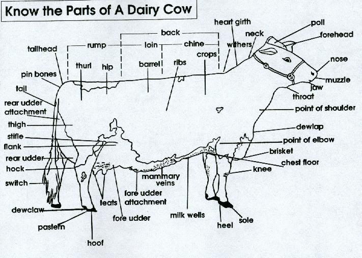
Diagrams in general function as tools for relaying information from one entity to another. They are a means of communication just like writing, radio, television, and speech. However, diagrams can function as learning devices and open visual and spacial areas of understanding in ways that most other types of communication cannot. Many important ideas such as location of objects, chronological order, or processes can be understood by looking at one simple diagram; in writing, these same ideas can take thousands of words to express the same thing to the reader. Therefore, in the context of writing, diagrams can supplement the writer and help him/her to convey the intended message in much fewer words. In the case where the information in a diagram is only a small part of the author's message but still critical to its understanding, the author can spend more time focusing his/her writing on more pertinent and complicated things then the simple but important things easily made understood through diagrams. One ramification of using diagrams in a virtual environment is the lack of reliability. Anyone can post diagrams and information on the internet, the diagram may be meant as a spoof rather than presenting fact. The diagram that I selected functions as a learning device by presenting the names of the parts of dairy cows and the relative location of those parts. The diagram can accomplish this for nearly any audience because it includes an actual image of a cow with the parts clearly labeled. In an audience that has no prior knowledge about the shape or structures of a dairy cow, it would take thousands of words to describe the shape of the parts and their relative location as effectively as the diagram. Now that the diagram has been removed from its original context, it merely shows the parts of a cow. The diagrams original intended purpose was to help the reader understand what area of the cow was being looked at while trying to judge a cow. As a writer, you are responsible for giving credit to the original composer of the diagram you are using. You should let your audience know if you are using it in a factual way or as a spoof. The details of the diagram that are important are the location of the individual parts of a dairy cow. They are labeled with lines pointing to the general location on an image of a cow. To improve understanding, I would have outlined the actual shape of each particular part of the cow to express its actual size and shape rather than only the location.